Restoration Works International Rebrand
Restoration Works International (RWI) is a non-profit organization that uses volunteer tourism to restore cultural heritage sites around the world. We had previously worked with their director and they thought of us when they wanted to rebrand their organization. Their logo was dated and needed a refresh that would bring awareness to their work. As is typical of most of our rebrands, someone at some point had hand drawn the logo and the original artwork was missing. What they had been using over the years was a very low resolution version that had not only degraded visually, but no longer captured the contemporary world we live in.
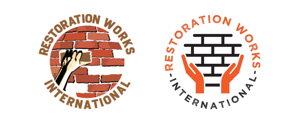
Our first step with a rebrand is to have a collaborative meeting.
We met with their director to discuss the vision for their new logo and what their goals were for their rebrand. Ultimately they wanted to maintain the integrity of the logo while modernizing it. We envisioned the grittiness of the restoration work and also that the logo would need to convey a sense of the world at large. Not just one country, but convey a feeling of inclusivity and diversity.
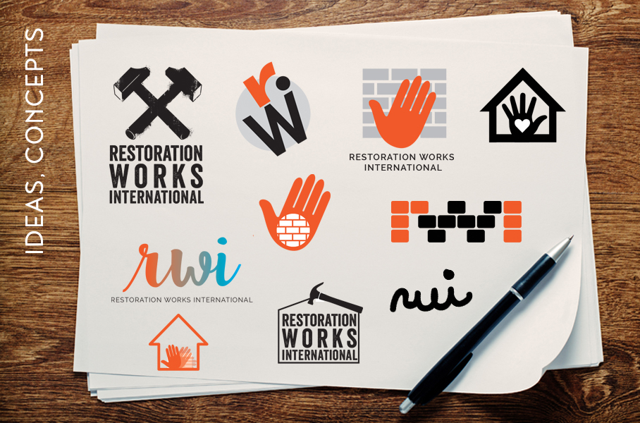
The next step in our rebrand process is to begin drafting up concepts.
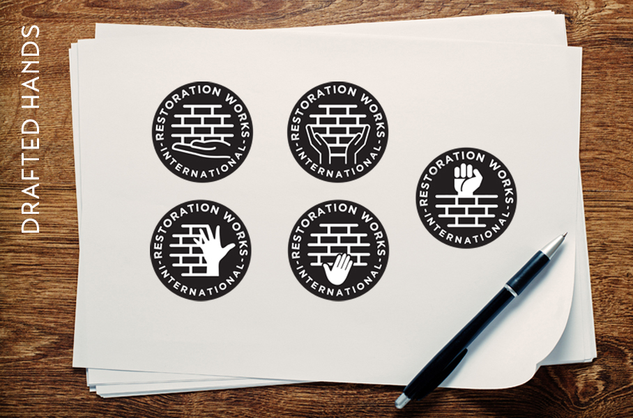
Part of our creative process is throwing a lot of different ideas onto the page almost like paint to a canvas, and then whittling down to the few standouts that check off all of the components and feelings the client is looking for. Exploring different fonts, colors, and textures while contemplating the meaning of every choice.
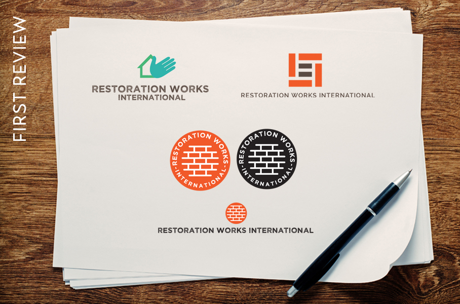
Once we had settled on our selections, we had our first review.
Feedback from the client is essential to making sure their vision is intact. RWI really liked the circular icon but wanted to keep the hands that represented the volunteers and personal touch that each restoration represented.
We came up with a few drafts of different hands and settled on the one that seemed the most caring, as there is a lot of intention and care that goes into restoring these sites.
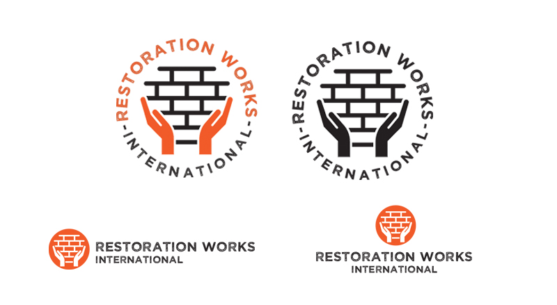
The final step was to provide all the logos in the formats that they would need.
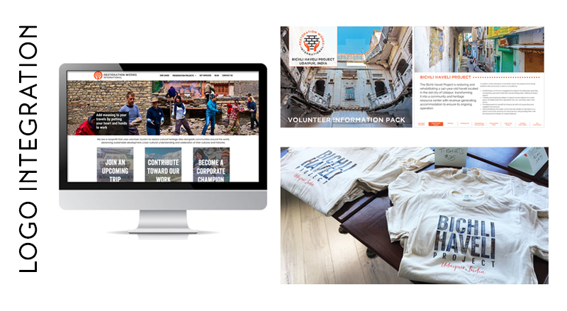
We then integrated it into their new website, their new digital interactive volunteer packet, and new t-shirts (all by Sarit + State as well).
Sarit + State were a delight to work with on the development of our new logo and website. So professional from start to finish, they asked the right questions to learn what we needed, formulated several creative ideas, and then saw it all through to completion on time and within budget. They have a strong understanding of the special needs of nonprofit organizations and were committed to the highest quality result.


